The Firefighter Fallacy: Why User Research Needs to Break Hierarchies

There’s a quote that’s haunted me since I first read it in my first year at university, a Google search has told me that it’s attributed to Kenyan commentator Onyango Oloo:

“One New York firefighter is worth ten British bobbies, is worth a hundred Bosnians, is worth a thousand Rwandans, is worth ten thousand Africans dying in a civil war.”

It’s brutal. It’s also true. It captures the media’s quiet mental model, how proximity, nationality, and familiarity decide whose suffering counts. People care the most about those in their close surroundings.

And, like it or not, we do the same thing in user research.

We build our own hierarchy of grief. Our own hierarchy of what matters.

Some users get our attention, our empathy, our meticulously crafted Miro boards. There are stories I can recount now of speaking to victims of modern slavery and addiction, as well as happier tales like the ‘Chicken King’.

Others? They get written off as “edge cases.”

Or “not our target audience.”

Or, the worst one: “interesting, but not actionable.”

The Firefighter: The Convenient User

In our world, the “New York firefighter” isn’t the hero running into a burning building, it’s the easy user.

The articulate one.

The one who shows up on time to their remote interview with good lighting and a nice microphone. The one who is closest to home.

The one whose worldview doesn’t challenge ours too much.

They might be:

  • A stakeholder whose “gut feeling” somehow becomes a research insight.

  • An early adopter in London or San Francisco who looks suspiciously like your design team.

  • A squeaky wheel customer who’s always ever so helpful when engaging with the sales team.

  • A loyal power user who says nice things and validates your backlog.

They’re great, they make us feel productive. They’re some wonderfully juicy low hanging fruit. But if we only listen to them, we’re designing for a subsection, one journey, one experience.

That’s not insight; that’s self-affirmation with via Figma, homogenous Heroku.

The Silent Thousands

Then there are the people at the bottom of the hierarchy — the users who never make it onto your recruitment spreadsheet.

They’re:

  • The ones using your service on a broken Android 6 phone over 3G.

  • The ones who need a screen reader and can’t get past your cookie banner.

  • The ones who don’t speak your default language, but have no choice but to use your product as ‘98% of users speak a level of English’.

When they do appear in your dataset, as a small, lonely dot in a sea of “positive feedback” we call them outliers.

We literally flatten their struggle into a data point. An aberration to be turned into an anecdote, to a blip, to being cut out of the narrative.

Their pain becomes “low priority,” or worse, “for phase two.” Stuffed into the backlog to be revisited ‘at some point’, which we know, never happens.

That’s the real tragedy of poor research — not lives lost, but opportunities missed, markets ignored, trust eroded.

Rewriting the Hierarchy

We love to say “users are at the heart of everything we do,” but all users are equal and some users are more equal than others.

If your sample skews to the loud, the local, or the lovely, your insight isn’t wrong - it’s just incomplete.

And incomplete research builds brittle systems.

The real work is unglamorous:

  • Recruiting the inconvenient. The ones who cancel twice or need translation support. When working within the public sector, those who are afraid of engaging with government.

  • Designing for the edge cases first. Because that’s where resilience and innovation live.

  • Context over convenience. Get out from behind the Zoom call and into the actual environment where people are struggling.

That’s how we stop treating users like headlines — and start designing for the full storyThat’s how we stop treating users like headlines — and start designing for the full story.

Because in user research, our job isn’t to rank suffering.

It’s to listen to every voice and actually hear them.

The Art of Interpretation, Sonic the Hedgehog and UX Storytelling

There are many Sonics.

I’ve fallen down the 90s nostalgia trap that is Sonic the Comic the Podcast, where the hosts go through every issue of Sonic the Comic. For me it is the definitive version of the blue hedgehog, however my opinion isn’t wholly common online. In recent years I’ve found out that many people don’t appreciate Fleetway’s take - and it’s reminded me just how many wildly different versions of the world’s fastest hedgehog exist.

There’s the cocky, anti-authoritarian 90s icon we all grew up with and marketed to within an inch of our lives.

The anxious, endearing movie Sonic who just wants a mate and some peace and sounds remarkably similar to Jean Ralphio…

The silent, existential runner from the games.

One character. A dozen narratives. Zero canonical truth.

And that, my friends, is basically user-centred design in a nutshell.

The value of what we make isn’t in the thing itself — it’s in what people do with it once it’s out there.

Stop Designing “The Final Product” (You’re Building a Starter Kit)

Design teams love to argue about canon.

What’s the real user journey?

What’s the one true tone of voice?

What’s “on brand”?

But users don’t care about your internal mythology.

They care about what actually helps them get through their day.

The second your product lands in someone’s world, amid the noise, kids, caffeine, browser tabs, and general chaos, it stops being your design.

They’ll use your beautifully crafted to-do app as a shopping list - that will slowly become abandoned.

They’ll turn your pristine comms tool into a meme dump, well I do anyway.

They’ll write their hopes, dreams, and expletives into the CRM notes field and then panic when they find out that it’s shared with the client (true story).

You designed a precision instrument. They’re using it as a hammer.

And honestly? If it still drives in nails, that’s a success story.

Fleetway Super Sonic: WHY Workarounds MEET USER NEEDS

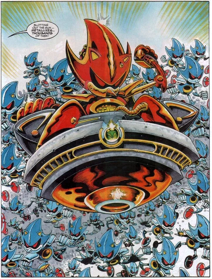
Fleetway Super Sonic is what happens when a design gets broken on purpose — and ends up even more interesting.

Originally, “Super Sonic” was meant to be heroic and in most interpretations he still is.

Sonic the Comic didn’t know that though, they saw a wild yellow design and thought “What if it’s pure evil instead?”

Same material, same design. Different story. Better result (fight me.)

Your users do this all the time:

They build a 12-sheet spreadsheet to replace your expensive dashboard because their way ‘just feels better’.

They send each other unofficial “fixes” in Slack instead of logging tickets.

They take a photo of your QR code, print it out and share it amongst each other because the “share” function is buried three menus deep.

They’re breaking your design for reasons that make perfect sense to them - but in their minds they’re not breaking it - they’re working with it.

They’re not misbehaving - they’re using.

Sometimes the best insight you’ll ever get is watching someone completely ignore your instructions and still win.

Coherence Beats Consistency Every Time

When fans debate Sonic, they’re not arguing about quills or shoes — they’re arguing about vibe.

Does this feel like Sonic?

That’s coherence — and it’s the holy grail of design storytelling.

Consistency is keeping the logo the same size on every page.

Coherence is making sure the story still makes sense when someone uses your product upside down, backwards, or with a broken mouse.

If your brand promise is “we save you time,” but your user spends two hours trying to export data, the story falls apart.

Coherence is what lets your design flex and still feel true when it’s bent by reality.

Design Isn’t a Finish Line. It’s a Starting Line.

Your user is the final designer. Always has been.

Everything we make is just a set of invitations and affordances, a starter kit for behaviour we hope happens.

The best designs expect to be broken, stretched, hacked, and remixed.

So stop designing like you’re writing a novel.

Start designing like you’re building a sandbox and share your iterative plan.

Let people play with it, break it, rebuild it, and tell their own story with it.

If it still holds together after that, you’ve made something genuinely human.

In the End: Sonic Survives Because His Story Does

Sonic has survived decades of reboots, rebrands, and reinterpretations because his story is simple - run fast, jump on robots to free animals.

That core still holds up, no matter how weird it gets. The same story could be reinterpreted countless ways.

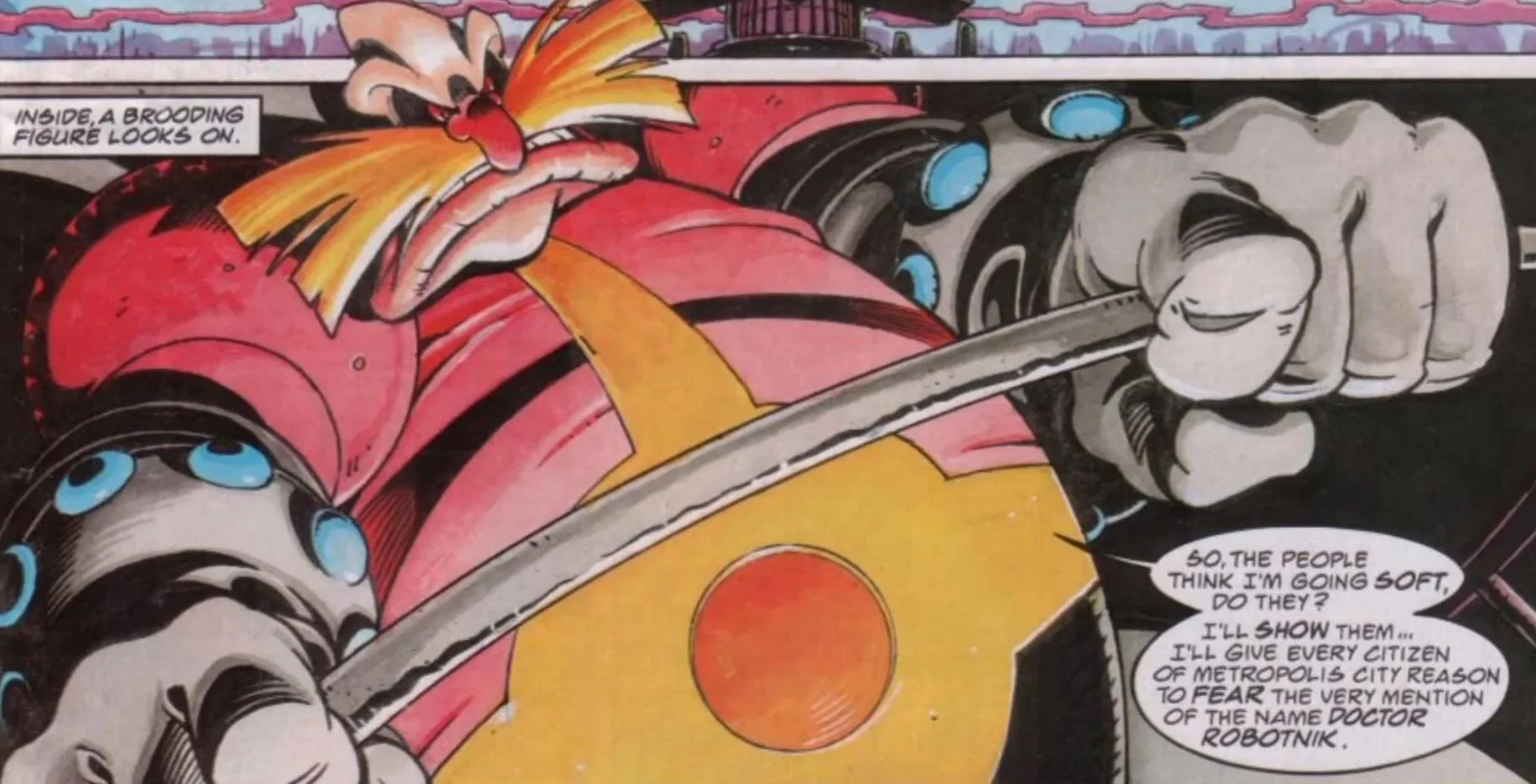
  • Evil scientist Doctor Robotnik (I’ll be long dead before I call him Eggman) is playing god, warping nature, enslaving innocents and remaking the world to his ideal automated hellscape.

  • A plucky band of environmentalists fight up against the man.

  • A hedgehog runs fast and jumps on robots.

Same source material - WILDLY DIFFERENT INTERPRETATIONS.

That’s the real UX storytelling lesson.

The story doesn’t have to be consistent, it just has to be true enough for people to keep making it their own.

Your product isn’t a sermon, let people play with it and get to their destination - play with it.

You Are All Weirdos (Or: You Are Not Your User)

We are all weirdos. The biggest mistake in design is assuming your own behaviour is "normal." This post breaks down how developer bias, civil servant norms, and even researcher assumptions derail products—and why embracing user weirdness is the only way to build services that actually work.

Read More

A Bundle of Resources - Jason’s Basic Tools

I'm often asked about the tools I use for user research. My secret weapon isn't a slick app, but a set of hand-drawn templates I use to plan projects, run sessions, and report findings. In this post, I share my three core tools for keeping research honest and actionable.

Read More

The User Research Audit - What is it?

Is your product's user experience stuck?

We've all been there: a product that looks great but just isn't connecting with users. You're trying to fix things, but it feels like you’re spiralling adding more information but not getting insight. What you need isn't more effort; it's more clarity.

My User Research Audit is a no-nonsense health check for your product. It’s an evidence-based approach to uncover friction points and missed opportunities, giving you a clear, actionable report with practical advice you can use immediately. Let's get to the root of the problem and build a better experience for your users.

Read More

Summer Reading '21

Some 2021 reading and watching recommendations - all available on Audible, Netflix or Amazon.

Read More

Summer Reads

A brief collection of books I recommend to read over the summer - some old, some new, some hopefully unexpected.

Read More